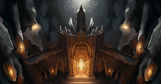
I released this map a couple of weeks back on my Patreon. As my husband would say, it is very “mood”. I keep enjoying creating maps that have very dramatic lighting, with lots of contrast. I don’t think that will ever go away.
I also enjoy giving DMs and players a lot of setting clues, which can be very tough to do in a strictly top down map. This is why I opt for perspective maps. I find the visual storytelling to be much more compelling. That being said, perspective in battle maps can get crazy!
I have a lot of fun picking apart and analyzing some of the most successful creator maps and how they use perspective. Some of the better maps you see out there, do not follow the well-established art rules, instead breaking them in the best possible ways to make what would have a been a good map, a great one.
Here’s one of the maps I analyzed recently. This is one of Cze Peku maps and it is fascinating how they use a mixture of different perspectives, and flat top down views, and still make a compelling, believable map.
Here’s the Grand Cathedral Map by Cze Peku
And here’s my perspective analysis on this map. It’s fascinating!
Technically, this map breaks all sorts of art rules, but the finished product is much better for it.
So the dilemma for me is - do I break the rules, and hope the end product ends up better for it, but then also risk Redditors and Facebookers coming for me with their pitchforks?
Or do I stick with the strict rules, top down view only, and preserve the boring, rule-following, colorless world of top down maps?
Ok top down maps really aren’t that bad. I still make em sometimes. I just prefer to have a bit more visual context than the strict top down ones can give me.
So yeah, I choose to break the rules. And I am always learning more to break the rules… better?
Long story short, this was my approach to the Dwarven Ruins battle map. I mixed all kinds of perspectives, and I LOVED it. The light came out great. The perspective is all kinds of messed up and barely follows any rules and is fantastic. I will probably get torched down on Reddit for it.
And here are some progress jpgs I saved along the way.
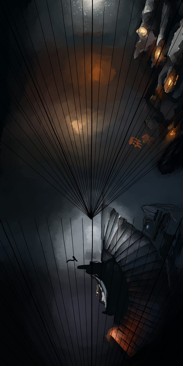
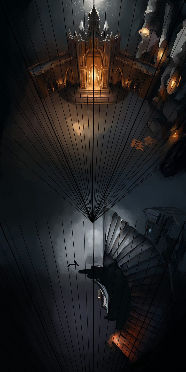
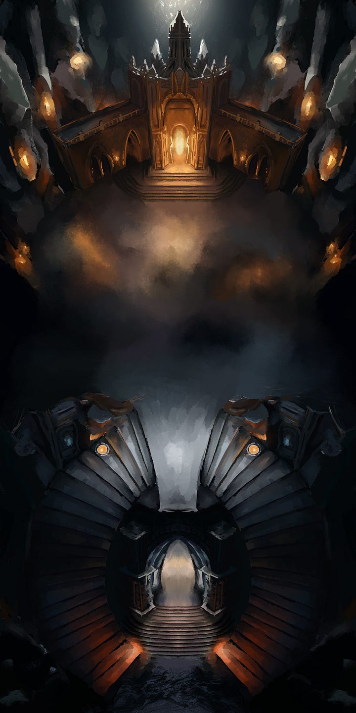
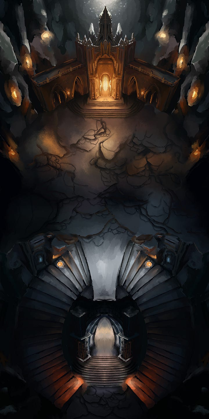
This map is available to you for free on my Patreon.



Hi Domille,
I think that perspectives you use are top notch. By having the varied and unregulated perspectives, you enrich the maps many fold over standard top down. Cze Peku make crazy maps in a similar way, as you know. To anybody who is upset about the grid not fitting perfectly, I suggest they look at this post by Mike Shea over at Sly Flourish - https://slyflourish.com/tyranny_of_the_grid.html .
He suggests that being tied to the grid for every little move and decision tamps down creativity and slows the flow of interaction in the game. The grid should be treated like a tool to use when it is helpful, but not valued above all else. Thank you for the fabulous maps!